

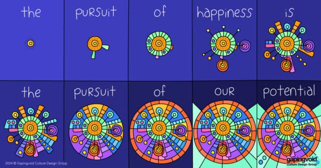
A Deep Well of Motivation
How to Solve the “Willie Nelson” Problem
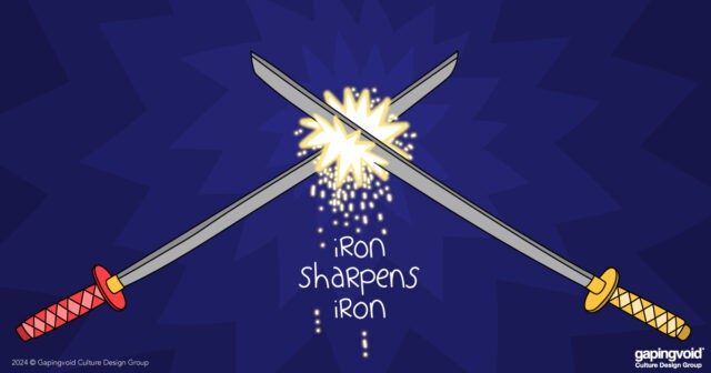
Nothing Beats Competition

If the Glove Don’t Fit, You Must Acquit
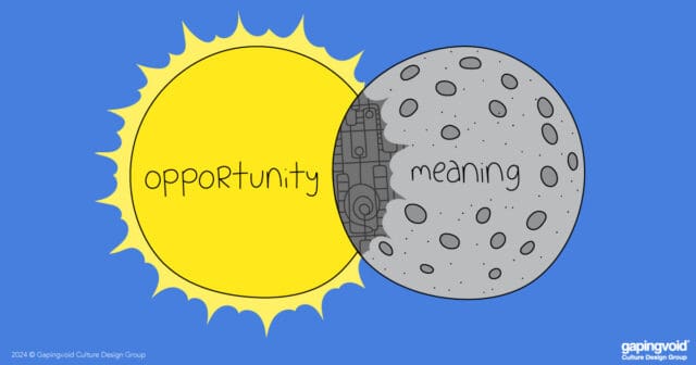
Eclipsed by Meaning

Are you playing half-court tennis?
Why We’re Measuring the Wrong Thing
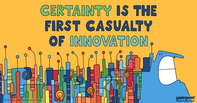
Why Certainty is a Red Flag
Daniel Kahneman’s Legacy: the Myth of Reason
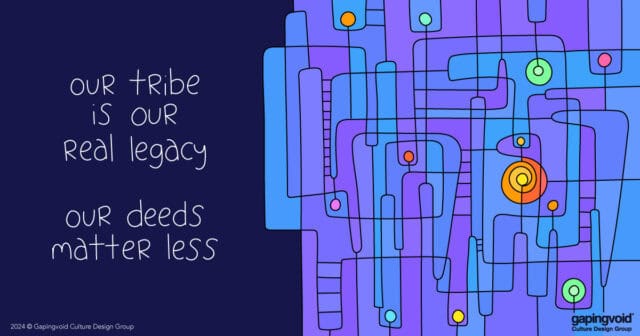
Belonging at Scale

Metaspeak about Metaspeak
- 1
- 2
- 3
- …
- 324
- Next Page »